News
Nordic AI in Media Summit 2026: A deep look into how AI is about to revolutionise the news ecosystem


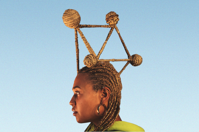
Anne Fehres and Luke Conroy & AI4Media / Better Images of AI / Data is a Mirror of Us / CC-BY 4.0
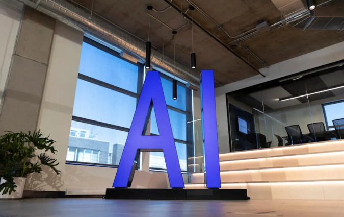
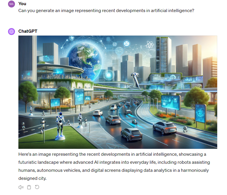
If you think back to the last news article you read on any development in AI, what was the image they illustrated with? It may have been a robot with eerie human features or mysterious lines of code on a blue background. I’ve used those kinds of images in my articles about AI.
AI is hard to depict unless you go for photos of screens showing open chatbot tabs or the logos of various AI companies. So the abstract robot visuals look like a safe option. However, in an information environment that already struggles to discuss AI accurately, they may not be the best choice.
Maggie Mustaklem, a DPhil student and researcher at the Oxford Internet Institute (OII), wants us to move on from what she calls ‘a one-size-fits-all sci-fi fantasy’ in the way we visually represent AI. In a recent blog post for OII, she questions the status quo for AI images. She asks why they include robots when the technology discussed has nothing to do with them and suggests that doing so may confuse readers and add to popular misconceptions about AI. I spoke with Mustaklem to explore why the visuals we use on AI matter and how we can better serve news audiences when selecting them.

Q. Why do visual representations of AI matter at all?
A. Responsible AI has become a huge new area and AI ethics and these kinds of research and policy areas are trying to improve fairness, transparency and accessibility and make sure that this technology is working for everyone. There's still a huge gap that everyone talks about: aside from the people who actually build AI systems and who are quite technical, the public doesn't understand these systems.
Images play a role in this: if you were writing a news article about apples, you wouldn’t put a photo of a pear at the top. But if you're reading a story about large language models, you have a photo of a robot at the top, even though there are no robots anywhere near large language models. I think that it reinforces the opacity and difficulty accessing and understanding the technology even for people in the media and for researchers. This is creating a gap in terms of how well we understand the technology.
Q. Could that be why we default to images like robots to illustrate pieces about AI – that we don’t fully understand it ourselves?
A. That's all that's available, so it's understandable. You're not outside the norm in terms of doing that.
Most people in journalism are presumably using mostly stock photos, and those stock libraries don't have different photos or don't have a range of ways to describe AI. They tend to fall into this sort of sci-fi imagery: blue brains, and the cyborgs and the robots touching a screen of blue code. The other thing is, if you look at AI photos from 25 to 10 years ago, they’re relatively similar to what you still see today. The technology has changed rapidly in that time, and the visual communication has remained static. That I think also contributes to this disconnect between research and practice and understanding.
Q. Where did this standard type of imagery that you’re describing come from?
A. I haven't done a deep art history dive into the origins of it, but if you look at graphics from early AI labs, it was present in the MIT AI labs in the late 1990s. It's been around for a while. What I've realised through some of the projects that I'm taking on now is that visual communication is divorced from research. It's not part of the fabric of hard-applied academic research, and it’s not woven into the fabric of journalism either – it's quite a separate department in newsrooms.
These visuals were developed largely independently of research practices. It seems like they developed in the late 80s and early 90s, and just became more sophisticated versions of that as graphics. If you look at the old computer graphics, they do look like computer graphics from the earlier generations of computing, but instead of rethinking what that graphic could be, it just got more and more lifelike.
Q. What are some of the messages this type of imagery conveys to audiences?
A. There's a lot of anthropomorphism in the messaging, there are often brains. There's this idea of AGI [artificial general intelligence] but this is still far from being a reality. When you look at the blue brain imagery, though, you think, ‘Oh, we’re here, this stuff is thinking like a human’ in a way that it's not: most AI at this point is still machine learning, which is considered narrow AI.
There's a lot of making it human, which I understand in terms of wanting to relate it to a human audience. But that is also misleading because it's not really what it's doing. There's often just a lone brain or a robot in a thinking pose. So it makes us think that perhaps AI is more clever than it is.
These images are often woven in with masculine imagery. It often has blue tones or undertones to it in a way that conveys a sort of masculinity, and it tends to convey a little bit of sci-fi, a futuristic version of the technology. There's loads of AI on your iPhone that you use every day, but the images depict a narrative of the future rather than explaining what we currently use. If you did visual communication on AI from the perspective of data labellers in Kenya, you’d probably get a really different picture of what this technology looks like. I think perhaps aspects of the tech industry have become entrenched in terms of the [San Francisco] Bay Area's dominance or male dominance or narratives that sort of support that line of thinking.
Q. Can you offer any alternatives for illustrating articles about AI?
A. Through a Cambridge University seminar during lockdown, I came across Better Images of AI, an NGO based in London. They're doing incredible work where they're commissioning artists to create images of AI and they've made them all Creative Commons. They've been pretty successful. For example, they've been in touch with the Guardian, which sometimes seems to be using their images.
There are a couple of other interesting projects out there where people are doing some interesting rethinking of this imagery. However, just recently I’ve taken on a healthcare client to work on its AI content – both writing and visual communication – and none of the Better Images of AI graphics work for this context.
The problem is bigger than what this NGO can solve, and what really should be happening is that visual communication should be woven into research, content and planning earlier in the process.
It would be very unusual for an academic researcher or a journalist to be involved in the final photos that are used in a story. There are also limited resources in terms of how these workflows are set up. But the problem is quite vast, especially when you get into specific industries, like healthcare, automotive, all these places where AI is popping up.
There may also be a business case that improving the imagery would improve engagement with media stories about AI because I think it would improve understanding. If you have photos that are supporting your story, you can tell a better story.
Q. A lot of the images we use to illustrate stories about AI are themselves AI-generated. Is that always appropriate for a story about AI?
A. I think it's unavoidable. Perhaps newsroom or publication teams need more support with visuals, but obviously, there are finite resources, even with a big corporate client, certainly with academic clients, and certainly in newsrooms. Generative AI can help with that. But of course, generative AI has been trained on the same imagery, the same sci-fi tropes and fantasies that we see. So it would take a really critical eye to engineer AI-generated photos away from from that.
Q. Newsrooms are often under-resourced and journalists struggle to get enough time to get things done. So what would you advise a journalist to do when they're illustrating a piece about A?
A. I understand you’ve finished your article and you're on deadline, so you need to sort it out and move on. But I would suggest trying to think a little bit about what AI is first of all. AI is a blanket term. It’s so many different things, from really advanced LLMs to sometimes basically Excel spreadsheets. So first think: is this machine learning? Is it a large language model, or is it generative AI? Is it computer vision? These are the stories you probably are covering.
Think about your domain area, and then think about images that are more specific to that context. That way, you stay away from using robots for an LLM story, for example. The best people to incorporate in this process would be the expert who’s written the article. They're the people who have the most insight into what the AI they wrote about does and doesn't do. Even if they're not graphic design experts, they can give some direction or some keywords to point it in a direction that would provide a little more clarity to the story.
In every email we send you'll find original reporting, evidence-based insights, online seminars and readings curated from 100s of sources - all in 5 minutes.
In every email we send you'll find original reporting, evidence-based insights, online seminars and readings curated from 100s of sources - all in 5 minutes.