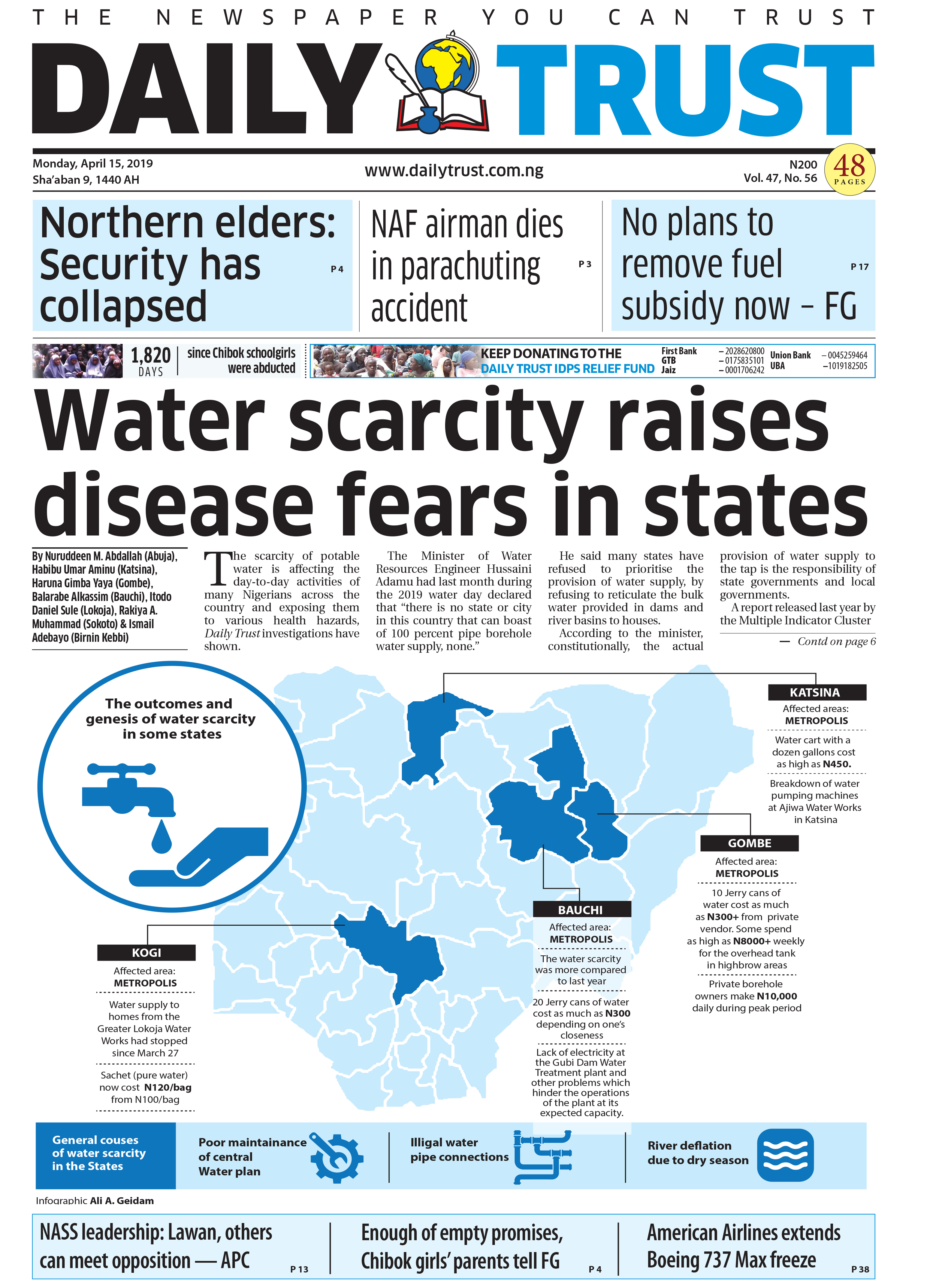
The use of infographics in Nigerian news media
 Nigerian journalist Chineme Okafor arrived at the Reuters Institute for the Study of Journalism to look at how newspapers could better use infographics to tell business stories.
He had noticed in Nigeria that several newspapers had taken to using infographics to convey complex information on national budgets, public policy and crime, and wondered if there were lessons to be learnt from media houses elsewhere.
During his three month fellowship, he studied the Financial Times, the BBC, the Guardian and others looking at the history and future of data visualisation in story telling. His Journalist Fellowship paper takes in the use of engaging visualisations of information from Florence Nightingale's graphic showing the causes of death during the Crimean war to USA Today's introduction of colour weather reports, with maps, tables and symbols in the 1980s that brought to life information that was previously “often dull and incomprehensible”.
Okafor, a Journalist Fellow from April to June 2019, analysed infographics in two print newspapers (Daily Trust and Business Day) and two digital outlets (Premium Times and The Cable) in Nigeria, looking at their use of infographics across a range of reports and subject areas and interviewed journalists in Nigeria and in the UK.
He concludes that while all reporters recognise the value of infographics, many older editors in Nigeria are slow to appreciate them. He calls for journalists to learn a range of skills from data mining to visualisation to take full advantage of infographics, and calls on Nigerian newsrooms to use more graphics templates and open source software to tell their stories.


