News
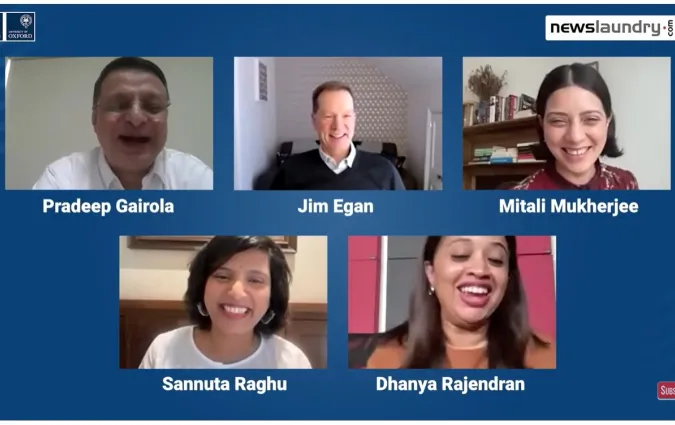
“Alarm bells are ringing in my brain” - Our Digital News Report India launch panel on low trust and shifts in news habits

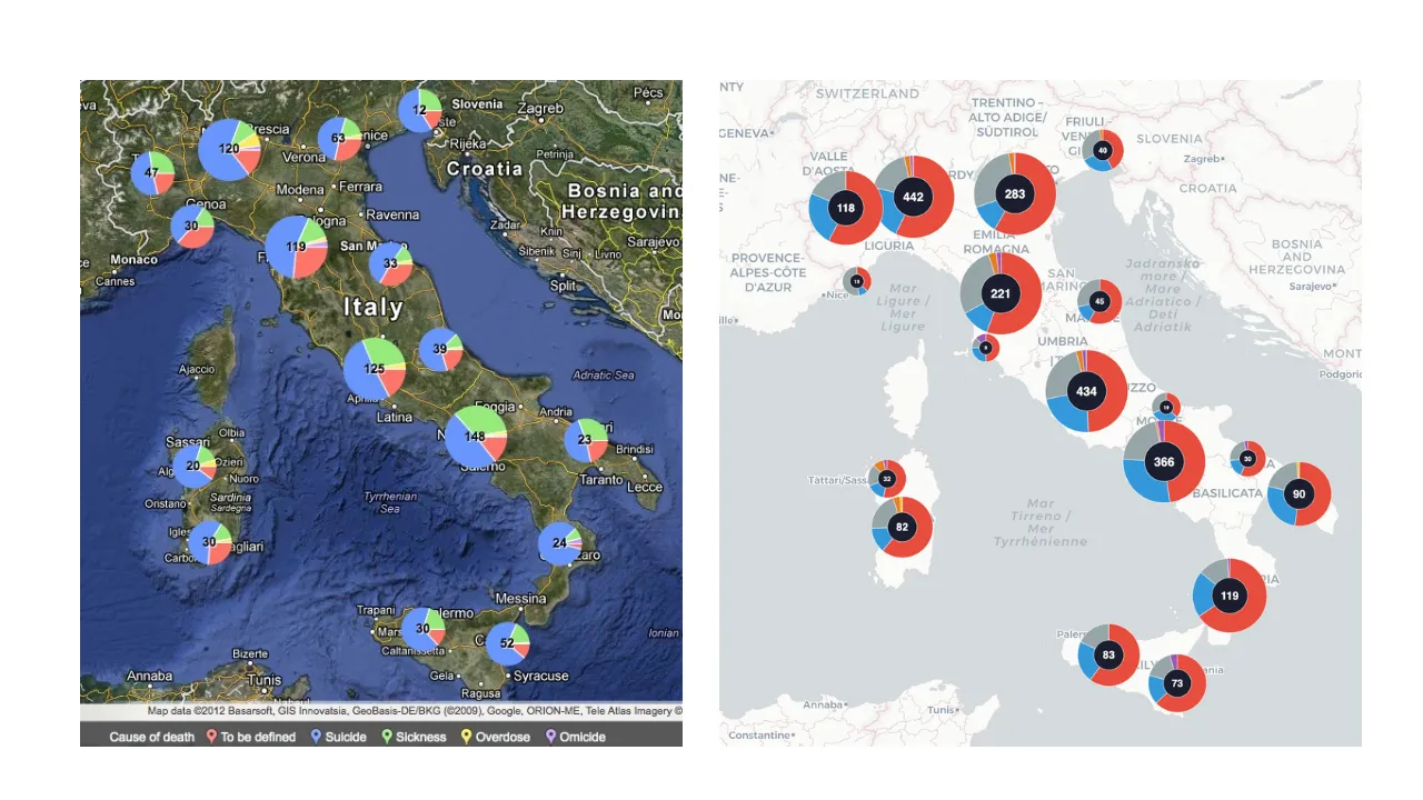
Jacopo Ottaviani's project Patrie Galere, before and after. The 2012 version was built by using a set of conventional software such as BatchGeo. The 2026 version was coded with Claude.
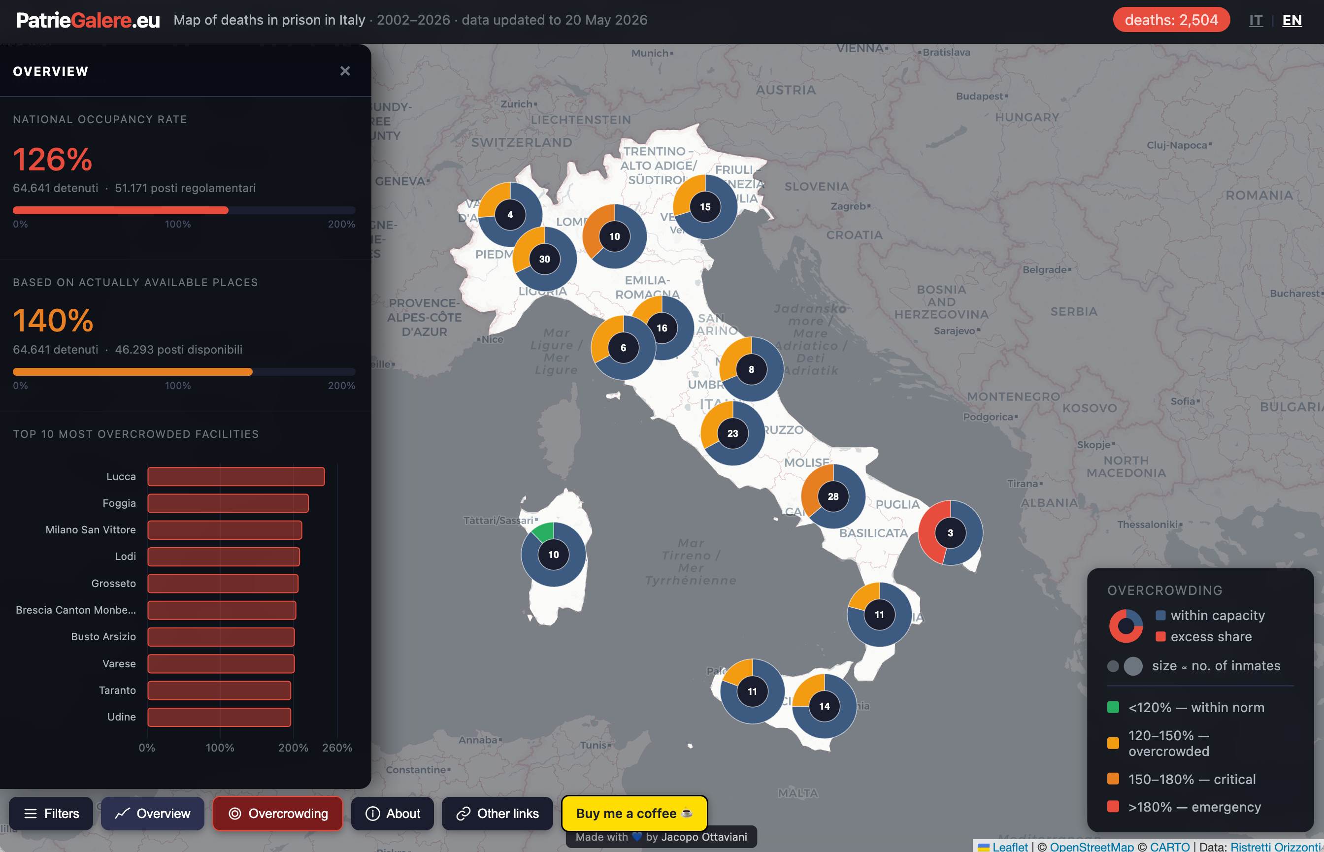
Between January 2002 and May 2012, 915 people died in Italian prisons. Just over half had taken their own lives. I wanted to show where.
In 2012, from a student room in England, I spent roughly three weeks turning a hidden spreadsheet into a map. The spreadsheet belonged to Ristretti Orizzonti, a newspaper produced inside Padua prison that has tracked deaths in Italian prisons since 1992. I was then finishing a master’s in computational linguistics, after a degree in computer science. The project, called Patrie Galere (Italian slang for “motherland’s prisons”), ran on the Guardian Datablog and earned a reputation among Italian practitioners as the country’s first data journalism project.
The tools were what I had in hand: BatchGeo to plot the points, Open Refine to clean the data, ScraperWiki to scrape it, hosted on Google Fusion Tables (a cloud-based data management, integration and visualisation service, now deprecated) and some manual HTML and CSS to put together a webpage.
Three weeks, a computer science degree, and a dataset I had read record by record. Most of these tools are now dated or defunct – early, single-purpose utilities for plotting, cleaning and scraping that a journalist had to wire together by hand.
I've recently rebuilt Patrie Galere in two days.
Fourteen years on, Ristretti Orizzonti is still doing its data-collection work, and the numbers have worsened: it recorded 254 deaths in Italian prisons in 2025 alone, around 80 of them suicides, among the worst years since 2012.
What changed was the toolkit I’ve used to visualise it. I now had a large language model, or LLM – an AI system that generates text and, in this case, working code from instructions written in plain English. This is how I did it, and what it taught me about the future of AI-driven data visualisation.
The 2012 map was a set of pie charts on a single view. The new version, live on my GitHub page, is a dashboard with filters, a section on prison overcrowding, and an interface in both English and Italian. The map runs on LeafletJS, a free, open-source library for building interactive maps on the web. The overcrowding figures come from Sovraffollamento Carcerario, a project by Italian journalist Marco Dalla Stella that scrapes data from the Italian Ministry of Justice.
I wrote none of it by hand. I used two AI models in combination: Claude Opus for the initial architecture and conceptual heavy lifting, and Claude Sonnet for iteration, refinements and smaller additions. Together they acted as a kind of standing team – a designer, a coder, and a data scientist who reply instantly.
To assemble that team in 2012 (or even in 2022) I would have needed a budget and several months. Instead I set up a project in Claude Cowork and split the work into around twenty discrete tasks, each with a single purpose. For each one I described in plain words what I wanted and let the model write the code. This way of working has a name now. It is called vibe coding.
There is another benefit here. Any code an LLM generates can be saved into my own repository and stays mine. A map hosted on BatchGeo or any other proprietary service lives only as long as that service does. BatchGeo, which the 2012 map relied on, first filled the map with ads and later took my map offline and the project died with it. The new code is mine, open source, on my GitHub, hostable anywhere.
The build was not frictionless. The bilingual interface translated visible labels on buttons and headers but left some text written deeper inside the code untranslated in English, a gap you only catch by reading closely, and fixing it took several rounds of pointing at specific broken elements.
Worse was the clustering bug. When I grouped nearby markers to reduce visual clutter, the totals and subtotals shown on the clusters were inconsistent: the numbers did not add up correctly. The same happened in the dashboard: totals of deaths and suicides visualised on the line chart per year were off.
The model had written plausible code that produced wrong totals. I caught it only because I cross-checked against the source figures, and once I asked the model to double-check, it located the problem and fixed it in a single prompt. The lesson is that plausible-looking output and correct output are not the same thing.
Anthropic's Fable 5 model was released on 9 June 2026, a Mythos-class model, the most capable tier Anthropic had released. It’s powerful enough that it can be used in cybersecurity, where it scans software for vulnerabilities and writes the code to patch them.
I pulled a Rome road-safety project off the back burner and tried to use Fable to build the whole portal in one pass.
On 12 June, citing national security, the US government banned foreign access to the model over a disputed flaw in its safety guardrails, and Anthropic disabled it the next day (at the time of this writing Fable 5 is still suspended). What I managed to build in that window was far more sophisticated than what previous models had proven able to do, and with less effort on my part.
The portal is Strade Mortali (Italian for "deadly roads"), covering road accidents in Rome (those involving cars, motorbikes, bicycles, scooters and pedestrians) using open data from the Rome administration's public portal. The latest data available is from 2022.
Fable showed a dramatic leap forward in UI/UX and brand design compared to earlier models. It made visual and layout choices I would have had to specify explicitly with Opus, handled data integration with fewer corrections, and produced a coherent visual identity for the portal without being asked.
Alongside Strade Mortali, I also rebuilt my personal site from scratch using Fable, which gave a further measure of what the model could do when left to exercise design judgment. But the most striking analytical output was what I call the “killer-crossroads index”, a ranking of Rome's most dangerous junctions that weights crash counts against the dead and the wounded, so a place with many minor collisions does not outrank one where people are regularly killed.
I had asked for a plain ranking and expected to refine it afterwards. Instead Fable proposed the weighting unprompted, explained why a raw count would mislead, and built the index before I had asked for it. I sample-checked the weighting against the source data before trusting it; output that arrives looking finished is exactly what tempts you to skip that step.
The public value is straightforward. The City of Rome could run this portal with fresher data, updated automatically, as a live guide to where a new pedestrian crossing, a speed camera or a junction redesign would do the most good. The prototype is live on my GitHub page.

The twenty tasks that made up Patrie Galere were not arbitrary. The idea behind them is borrowed from computer science — divide et impera, divide and conquer. When a problem is too large to solve whole, you decompose it into sub-problems that are each solvable on their own. Then you stitch together the whole product.
Faced with the prompt: "rebuild Patrie Galere", a model will try to do everything at once and hand back a tangle nobody can debug. Faced instead with "build the marker-clustering layer so the pin counts match the records", the result is usable.
The set for Patrie Galere ran roughly through cleaning and structuring the raw data; the base map; the marker layer and clustering; the filters; the legend; the overcrowding data layer; the menu bar; the header and footer; the about page and the data-sources page; the bilingual switch; and the visual design holding it together.
Each is a self-contained question with its own right answer, buildable and testable without touching the others. It also helps to assign roles explicitly – telling one task to act as a data engineer and another as a front-end developer keeps outputs focused and makes bugs easier to trace.
This approach maps naturally onto the stages of a data journalism pipeline: research, scraping, cleaning, visualisation, cross-checking. Structuring tasks around those stages does not just make the initial build easier; it makes updates and maintenance easier too. When the underlying data changes, you know exactly which task to revisit. In an era of AI agents that can run unattended, that modularity becomes more valuable still.
Order matters. I tackled foundational pieces first, the clean dataset and the base map, then the independent ones one at a time, checking each before moving on. A bug surfaces sooner when the component that carries it is its own task with its own check. In one undifferentiated request, the same fault would be one among dozens, far harder to isolate.
Then, you climb back up. A legend that reads clearly in isolation can mislead beside a filtered map; a colour scale that works for prison deaths needs rethinking for accident severity. Reassembling the parts is its own step. Each component had its own task in Claude Cowork, a workspace where you organise an AI assistant’s work into separate, parallel jobs. This way I could iterate on each in isolation, with on average five or six rounds of back-and-forth per task.
Software engineering and design skills sharpen this further. Knowing in advance that LeafletJS was the right mapping library, and that it came with a built-in marker clustering function, meant I could specify that from the outset rather than letting the model pick its own approach. That single decision saved a significant amount of back-and-forth and avoided the kind of circular iteration that wastes time and tokens.
Models charge by the token, roughly a fragment of a word, for everything they read and write, so every extra round of correction adds cost. The most capable models, like Claude Opus, cost far more per token than lighter ones, which makes getting the instruction right the first time matter more the more powerful the model you are paying for. Fable 5 was by far Anthropic's most expensive model, apparently twice the price of Opus 4.8.
More broadly, knowing what a well-structured data pipeline looks like, recognising when a visual layout is breaking down, understanding the difference between a frontend and a backend problem – these judgements shape the tasks you write. A model executing a poorly specified task still produces something that looks finished. The ability to see through the surface to the underlying structure is not something the model supplies; it is what you bring.

As these models mature, the mechanical layer of data journalism is becoming a commodity. Turning a spreadsheet into a map, cleaning a messy dataset, building a ranked index from open records — any of it is now within reach of anyone who can describe what they want in plain language. Within a few years, fluency with these techniques will no longer distinguish a data journalist from anyone else with a story to tell.
What does not commoditise is the judgment about which question is worth asking, and the persistence to stay with the answer until it lands. Both of my projects straddle journalism and civic technology. Strade Mortali could help a city prioritise safety interventions; Patrie Galere documents institutional failure of the kind a ministry could act on.
The tools are usable now, and building either takes days rather than months. Yet usable is not the same as used, and data use will most likely require human engagement that will not be easily replaceable by machines.
This extends to the tools data journalists have long paid for. Fable 5's performance points to what practitioners are calling the “SaaSapocalypse”: the moment when LLMs become capable enough that the value of subscribing to proprietary software-as-a-service (SaaS) tools collapses, because an AI can build a bespoke equivalent in an afternoon.
Data visualisation tools are an obvious early target. By combining tools like Claude Code or OpenAI’s Codex with open-source libraries – D3.js for charts and statistical graphics, Chart.js for simpler visuals, Leaflet.js for maps – a journalist can generate a production-ready, fully customised visualisation from a plain-language description. The resulting code is theirs to host, version and modify.
There is no subscription to renew, no vendor to go dark, no proprietary format to migrate away from. At the rate these models are improving, the question of why a newsroom would pay for a proprietary dataviz tool when it can own the equivalent in open source is going to get harder to answer.
None of this means data journalism trainees should skip learning the underlying language of data visualisation, even more so. The opposite is true.
Understanding the grammar of charts (which visual encoding suits which data type, when a map misleads, what a distribution actually shows) is more valuable now than it was when building a visualisation took weeks. Knowing the stages of a data journalism pipeline, from acquisition and cleaning through to publication and verification, gives you the scaffolding to direct an AI effectively. And critical awareness of how data-driven messaging works – how charts can be technically accurate and deeply misleading at the same time, as Alberto Cairo explored in How Charts Lie – is a prerequisite for anyone producing or editing AI-generated graphics at speed, more so when anyone can assemble a complex dashboard in minutes.
The harder problem has moved downstream. It is no longer how to produce the visualisation but how to get it seen, and held in attention long enough to convert into action, in an environment of information overload and shrinking attention spans. And being seen alone is not enough: it matters whether the audience has the scientific literacy to critically assess the data as it is served to them, and access to the knowledge required to handle it responsibly.
A visualisation read uncritically can mislead as easily as it informs. The mechanical work is finished in an afternoon; the work of making it matter (and making it understood) is not automatable, and it is where the data journalist's role now concentrates.

Journalists hold a real advantage here that is easy to miss. They are trained to take something tangled and make it followable, to break a knot into pieces explained one at a time. It’s the same skill that is used in splitting a portal into twenty single-purpose tasks. Journalists' natural instincts map neatly onto directing an AI agent, a system that carries out multi-step tasks once you frame them clearly.
Generalist journalists, those with wide knowledge and broad lexicons who know a little of everything, are particularly well placed. Orchestrating a team of AI agents across research, data, design and fact-checking draws on exactly the kind of cross-domain awareness that generalist reporting builds. And journalists carry something else into the workflow: a finely tuned instinct for when something does not add up. The same bullshit detector that flags a dodgy quote or a suspiciously round number works on AI output too, and it is a skill no model currently replicates.
At its core, this is about communication. Moving an idea from your mind to the page – or, in this case, to a prompt. Clarity of thought produces clarity of instruction. A journalist who can precisely describe a story, its scope, its angle, its gaps, its audience, can apply that same precision to an AI agent, and the output reflects it.
As El País data journalist Daniele Grasso put it recently, technical knowledge matters and amplifies those strengths, but judgement and strategy are more important than prompting. Used well, AI does not make us think less. Quite the opposite: it demands creativity and computational thinking, and gives us the opportunity to cultivate what makes us more human.
You still have to know what you want, expect the output to contain mistakes, and go looking for them. The arrangement I trust is a hybrid one: human and AI working in parallel, with the human accountable for everything that ships.

Data inconsistencies and discrepancies proved among the hardest problems to root out. Figures that looked plausible on the surface often concealed mismatches between source records and the reconstructed dataset that only surfaced through careful cross-checking. The experience points to a concrete next step: AI fact-checking agents working as automated guardrails on the data itself.
Jaemark Tordecilla, who explained how he vibe-coded a health survey dashboard in the Philippines, developed exactly this kind of pipeline. Stronger structural checks, not just a single verification pass, were needed to catch them. That idea directly informs the road ahead here, at least until new models eliminate this need.
Both Patrie Galere and Strade Mortali are still in active development and should be treated as working prototypes. They may contain bugs, inconsistencies, or incomplete data. While AI-assisted data journalism can feel like a magic wand, there is a strange unease in delegating even a small part of that process to a machine. A sense that hidden discrepancies may be lurking just around the corner. This risk can be reduced by a strict set of agents acting as fact-checkers and guardrails, and it will decrease as models progress.
The next step for Patrie Galere is an audit agent, software that reconciles the rebuilt dataset against the original Ristretti records one by one. Beyond that, a scheduled agent, a recurring job that runs automatically on a timer, would refresh the visualisation every couple of months, with the longer aim of a live observatory of deaths in Italian prisons.
For Strade Mortali the immediate ambition is fresher data pulled automatically from Roma Capitale's portal, so the index tracks the city as it is now rather than a single frozen download. Another idea is to use the tool to nudge local authorities into sharing more data on recent years.
The bottleneck has shifted. Between 2012 and 2022 the main bottlenecks were in the build, and the people, budget, and timelines involved. Now all that is increasingly getting commoditised. The hard part is deciding what is worth building, confirming that what you built is true, stewarding and overseeing the AI, and ensuring the target audiences are using it for actual change.
In every email we send you'll find original reporting, evidence-based insights, online seminars and readings curated from 100s of sources - all in 5 minutes.