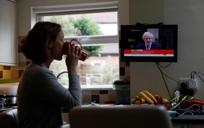
Johny Cassidy, a BBC journalist, was a fellow at the Reuters Institute during Michaelmas Term, 2022. Picture taken by Emily Bold.

Johny Cassidy, a BBC journalist, was a fellow at the Reuters Institute during Michaelmas Term, 2022. Picture taken by Emily Bold.
As the use of visual data journalism becomes more embedded in day-to-day newsroom operations, there’s a very real danger that those who can’t decipher visual information in the usual way will be left behind.
During the COVID-19 pandemic there was no shortage of news about the spread of the virus, but it was the graphs and illustrations that made the severity of the situation plain to see.
Consider this simple chart produced early on in the pandemic by the Centers for Disease Control and Preventions, reproduced in The Economist, the New York Times, and elsewhere:
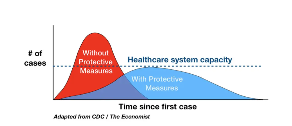
A copy the New York Times' "flatten the curve" graph, published in early 2020 to demonstrate how preventative measures would impact the spread of infection.
The chart showed how measures like mask wearing and social distancing could “flatten the curve” and reduce the peak of infections. It was shared widely across social media and amplified across news sites. But a 2021 Massachusetts Institute of Technology (MIT) research project found that this chart was of no use to millions of blind people.
The MIT project found alternative text – which makes images accessible for people who use screen readers to navigate the web – was often missing from online charts. When it was included, the alt-text was frequently uninformative or even incorrect.
Further analysis of health messaging shared across Twitter during the COVID-19 pandemic carried out by researchers at Carnegie Mellon University found that, of 55 government agencies disseminating health information about COVID-19, only 12 had included any meaningful alt-text for their visual data.
The problem of accessing this vital pandemic information became so pronounced that a blind web developer from Boston took it upon himself to create an accessible website that pulled all health data into one accessible place.
As a blind journalist fellow at the Reuters Institute for the Study of Journalism, I set out document issues around unequal access to information, review some emerging solutions and consider how we can begin to make visual data journalism more accessible to screen reader users.
The good news is that, across the world, newsrooms are waking up to the need to make their visual data journalism more accessible. The New York Times recently announced Jaime Tanner was to become their new Accessibility Visuals Editor – a post which didn’t previously exist.
Tanner, whose background is in data viz, said she has already found that making visual data more accessible is something her colleagues in the newsroom are keen to build on and which is seen as an exciting opportunity. “I think everyone’s eager and willing to do what they can to make this work more accessible,” she told me. “The thing that keeps you going is knowing that folks are excited and eager to do it, and happy to do it.”
The Financial Times is another publication that takes accessibility extremely seriously. For Alan Smith, who leads the FT’s Visual and Data team, the challenge is being able to deliver accessibility at scale and not just in one-off projects.
“It’s one thing to come up with a researched thing which allows you to explore the nuances of best practice and to tweak things on an individual project,” he said. “It’s a bit more of an issue when, like at the FT, you produce something like 20,000 charts a year. We might say it’d be great to have sound on our charts, but there’s no way we can build 17,000 charts a year which have sound on because the infrastructure just isn’t there for that kind of volume.”
Smith is also aware that accessibility considerations and requirements can sometimes pull in different directions which adds to the complexity of finding a viable solution. Someone with a cognitive impairment, for example, might benefit greatly from visuals rather than paragraphs of text, whilst for screen readers user paragraphs of text are the more accessible option. “Having something that is flexible enough to take into account a variety of accessibility requirements for us simply doesn’t exist at the scale we need to deploy it at," Smith explained.
There are guidelines and resources available for anyone creating digital content. The Web Accessibility Guidelines, WCAG, do provide a framework of sorts which can help. These guidelines however often come from a compliance perspective and have been described as the very bare minimum for accessibility.
Frank Elavsky, a researcher at the Human-Computer Interaction Institute at Carnegie Mellon University and a recognised expert in the accessibility of visual data journalism believes many organisations following the WCAG guidelines should be going further than compliance and need to be pushing for better accessibility.
As well as meaningful alt texts and awareness of accessibility needs, other modalities for reaching more people with visual content are also worth exploring and experimenting with. Tactile charts and sonification, for example, are both really exciting areas which could bring benefits to a wider audience. In 2021, musician and visual data designer Carni Klirs used sonification to represent what 450,000 Covid deaths sounded like.
What was clear from my interviews was that the data vis community are already heavily invested in accessibility. Many people are working hard to create content that is more accessible to more people. All too often though, they’re being left to figure it out on their own. In Visual Accessibility in the Wild: Challenges Faced by Visualisation Designers 2022, researchers from Boston College surveyed 144 data viz practitioners and designers for their thoughts on accessibility of data visualisations.
Survey participants said a lack of solid guidelines for making data viz more accessible meant they didn’t always know how to make their designs of use to a wider audience. And, when data viz designers do have an interest in making their content accessible for screen reader users, the lack of feedback on their work means they don’t know if what they’ve done is of benefit or not.
When accessibility evangelist Doug Schepers tells people he makes data viz for blind people the response is almost always a quick pause whilst the gears of their mind start spinning, followed by: “How does that work?”
Schepers, like many others, believes there’s no single correct way to make your content accessible – but he said this shouldn’t stop designers thinking creatively. “You need to consider your audience, and what you’re trying to convey,” he said, “and decide how you want to convey the information to them. You don’t just take every dataset and render it as a bar chart and call it a day. You think about the message you’re trying to send, and you pick the correct chart type, the right subset of the data, the correct framing, the clearest symbols, and the pithiest prose to craft your message. You adapt, remix, and innovate.”
The simple truth is that if organisations and institutions want to make their visual data more accessible then there’s no reason why it can’t be done. What it will take is a willingness for it to happen and for everyone involved to become accessibility champions.
During my time on the Reuters Institute, I realised that a lot of people simply aren’t aware of the needs for blind people when accessing visual information. I’ve also found that when they become aware of the issues and how to fix them, they’re delighted to be able to help.
Our fellowship had a WhatsApp group to keep in touch and organise various events. When my fellow fellows understood what alt text was, and how it was of benefit to me, they simply added it to every single image or photo they shared within the group. This was done organically and soon became business as usual.
It was also interesting to see how the group took on a combined responsibility mindset when someone genuinely forgot to add the alt text, with other members jumping in to add it. This community approach to accessibility is something organisations can really leverage to foster a genuine ambition to do more.